THE CHALLENGE
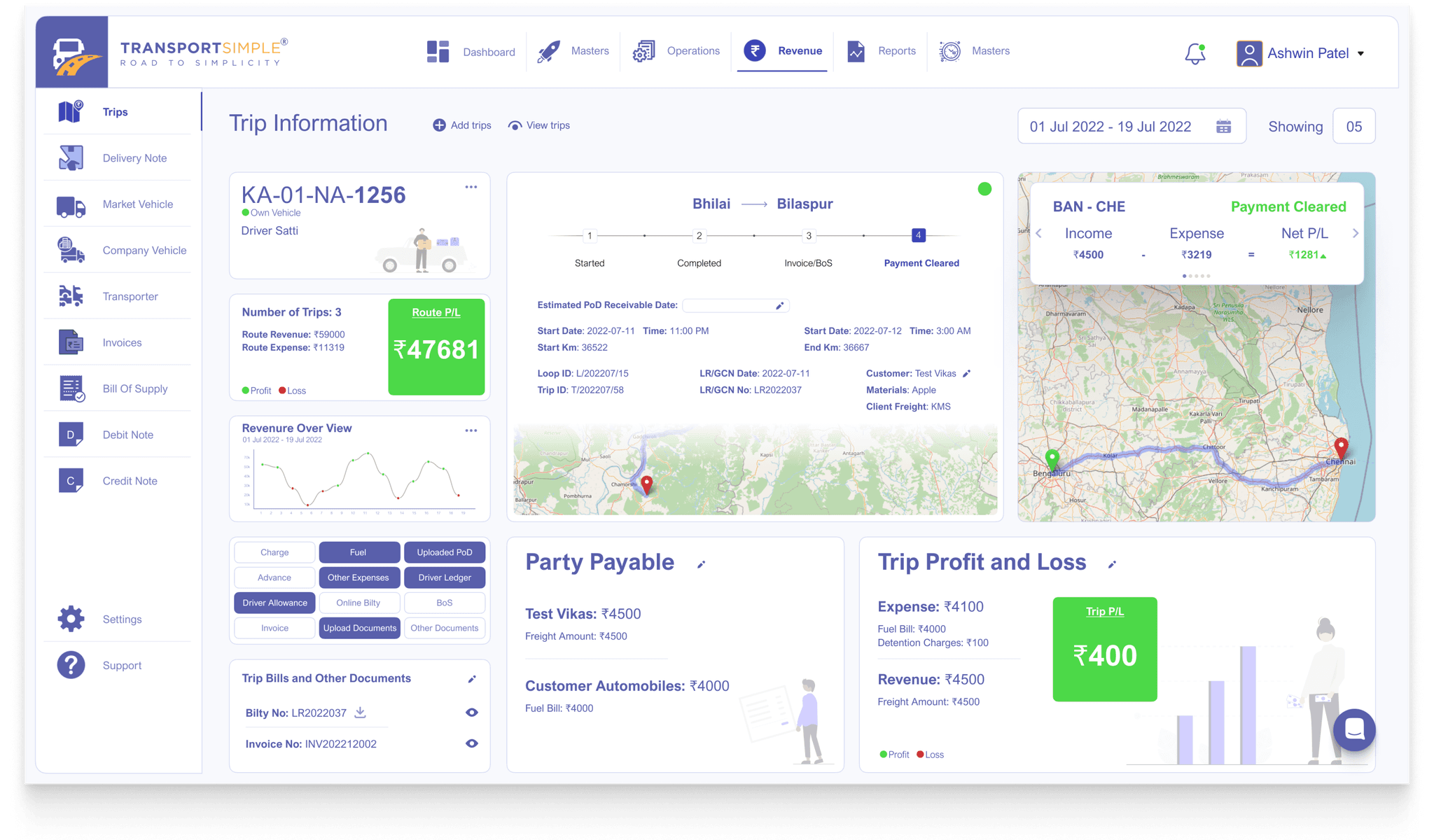
To design a user-friendly interface for a trip details screen that efficiently presents essential information about a trip, including vehicle and driver details, route summary, route profit/loss, trip details, trip status, options to add additional details, party payables, trip profit/loss breakdown, and trip bills with attachments. The challenge is to organize this information intuitively, ensuring clarity and ease of navigation while accommodating varying amounts of data for each section.
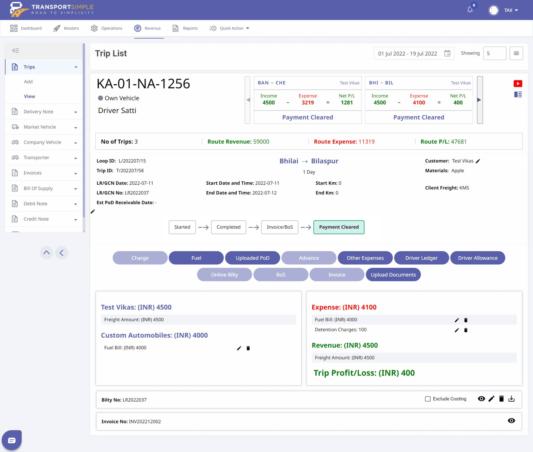
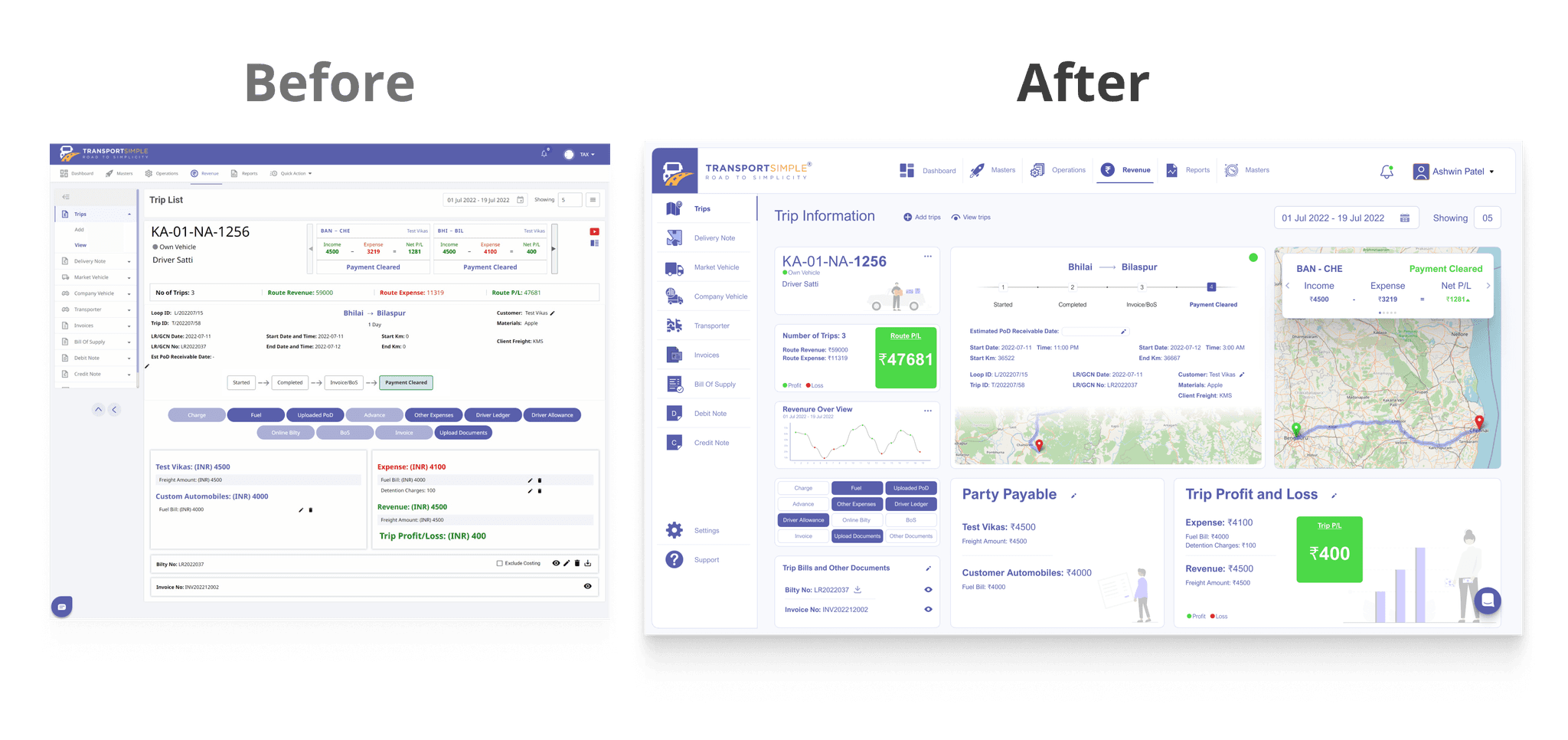
EXISTING DASHBOARD
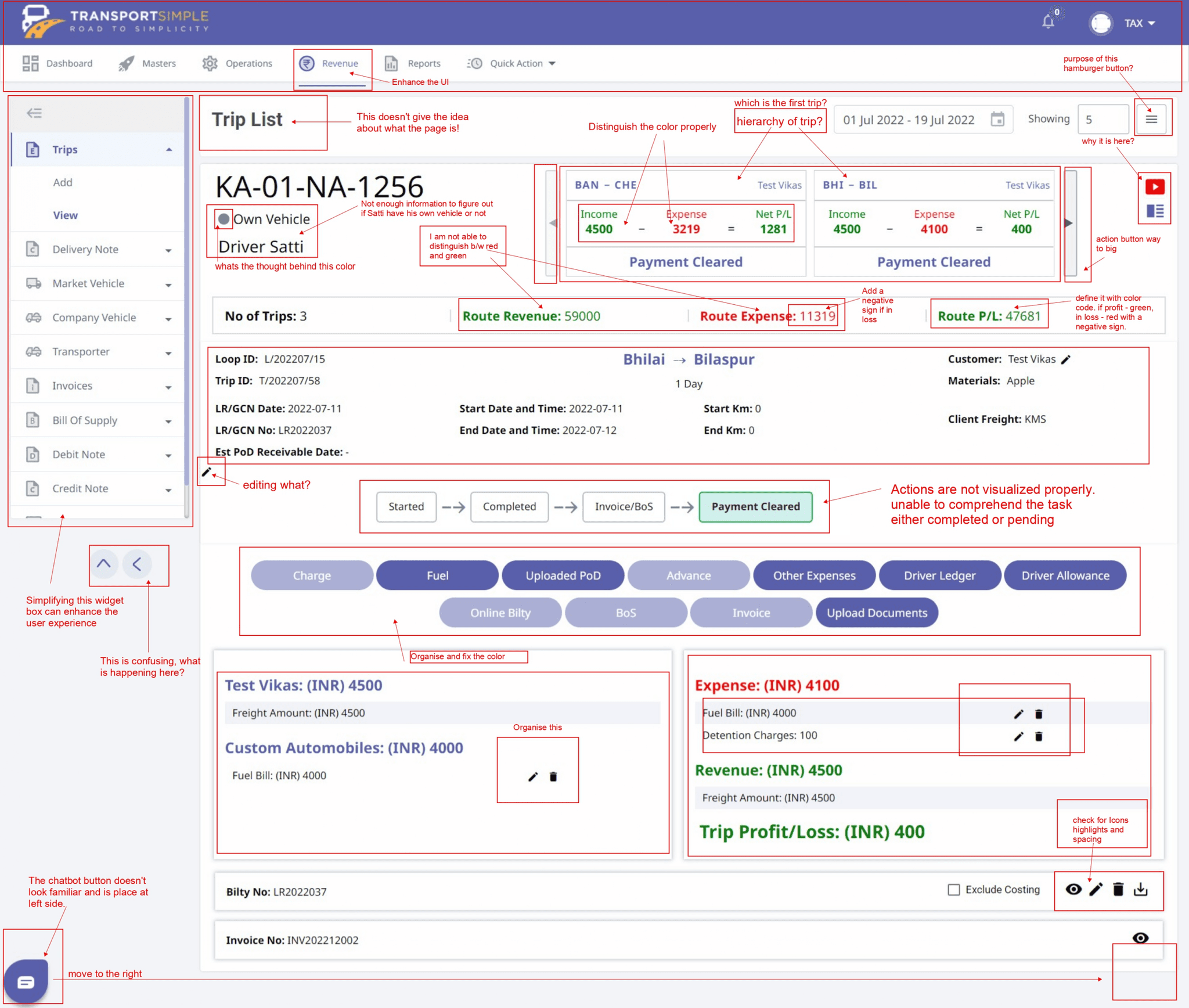
OBSERVATIONS
Vehicle and Driver Section
Highlight the vehicle 4 digit number; KA-01-NA-1256
Not enough information to figure out if Satti have his own vehicle or not
What is the gray circular icon define, the is the thought behind that color
Route Section
Hierarchy of the trip is not defined, which trip is taken first not cleared!
Color red and green not distinguished properly, make it more distinguished.
The action slider buttons are way too big.
Route profit and loss
Add a negative sign if in loss
Distinguish the color of the expenses
Define it with color code. if profit - green, in loss - red with a negative sign
Trip Detail Section
Fix the overall UI of this section
Give a head of the travel destination
Trip Status Indicator
Actions are not visualized properly.
Unable to comprehend the task either completed or pending.
Button
Organise and fix the color
Party Payable
Add more discrete information. The provided information is not enough.
Trip Profit and Loss
Fix icons spacing
Fix color coding
Fix the table highlights
Trip Bills and other documents
Such big section not required
GOAL
This design is primarily user-oriented. The quality and speed of work depends on the correct interaction between user and the design. The goal is to create an intuitively simple tool with one that will be convenient to work with everyday.
The design style is based on the fact that this tool will be used daily. I have simplified the design as much as possible and placed accents in the places where they are most needed.
Due to the fact that the field in which users work is complex and difficult to understand for beginners in the field, I have used the most understandable words that do not cause controversy.
The system always highlights processes that need your attention more than other processes. Thanks to this, you will never miss an important action or information.
I have researched the solutions that competitors have. In the process of creating a design, users are involved for testing. The most rational and expedient decisions were selected.
DESIGN
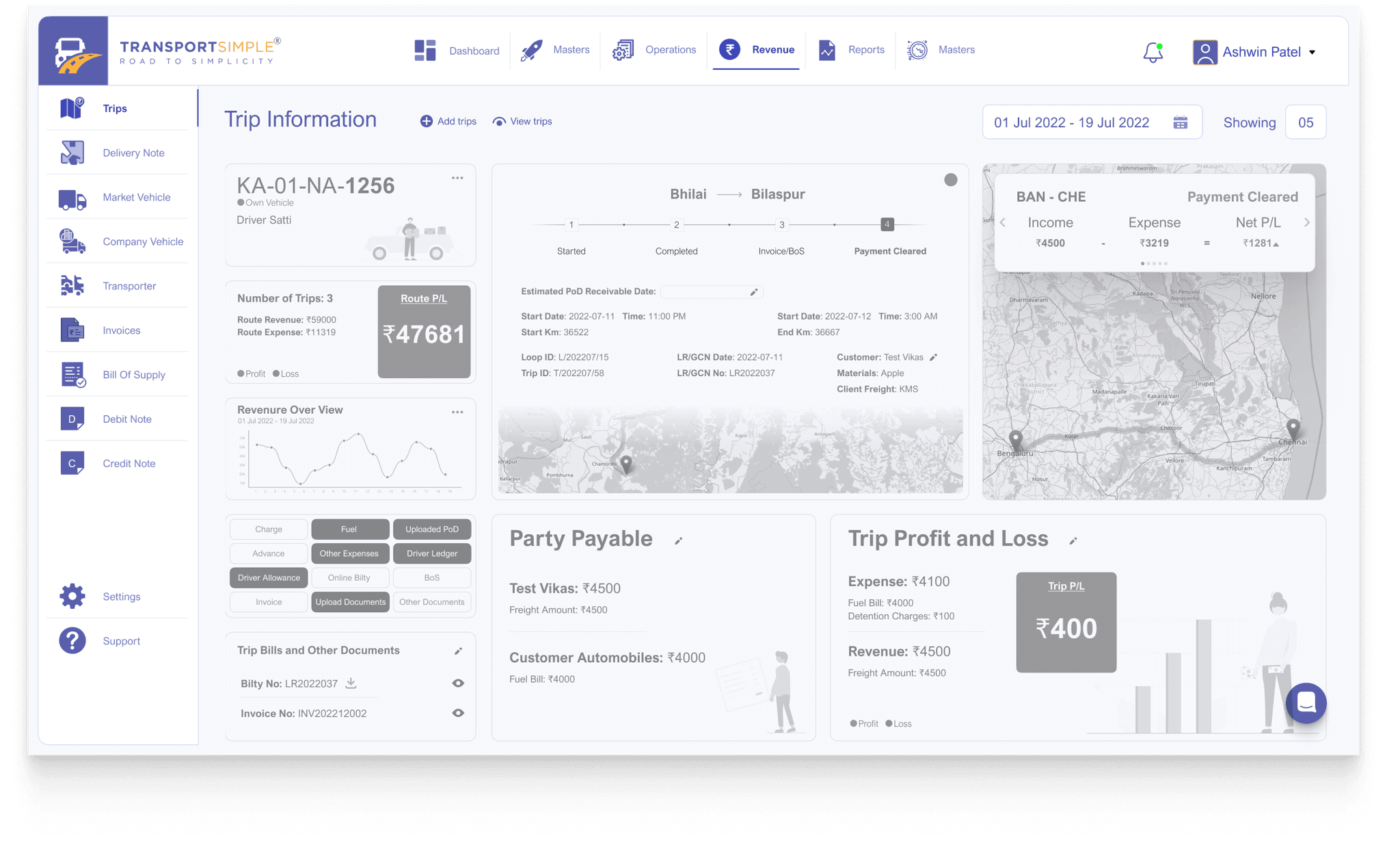
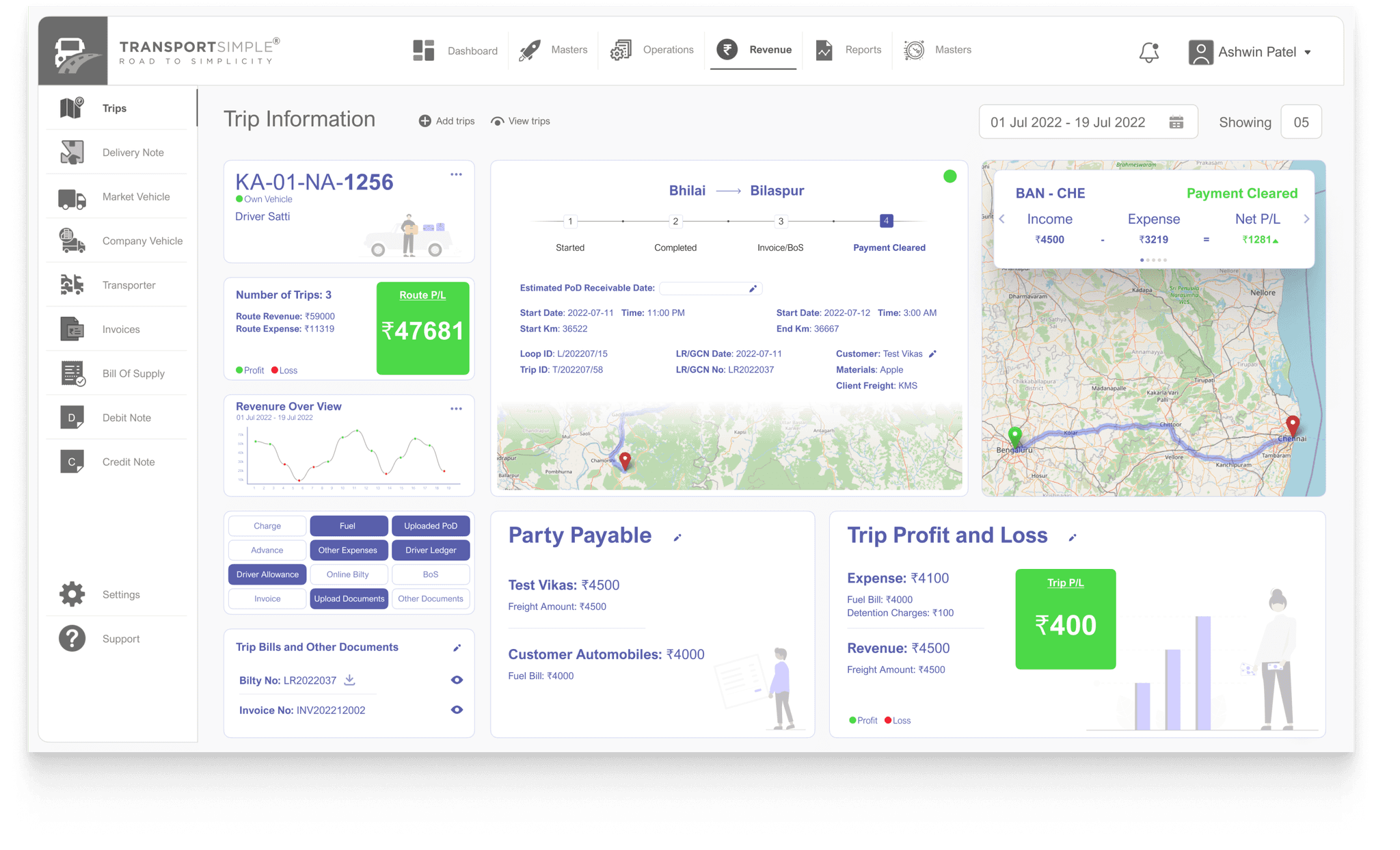
Improvised User Interface to enhance User Experience
The Navigation Bar and Widget tabs have been judiciously organised to ease the user interaction.
The boards have been judiciously organised to ease the user attention. The user can focus on one information at a time.
